Congratulations to the team of Aliya Ospanova, Anara Tleuova, Zulyal Kabenova and Yelena Trifonova for taking second place in the 2024 World Accreditation Day poster contest, and to Joshua Egahi-Ojo Alhassan for taking third place. Each runner-up entry earned a prize of USD 500.
 Aliya Ospanova, Anara Tleuova, Zulyal Kabenova and Yelena Trifonova work for the International Cooperation Department of the National Center of Accreditation (NCA) of the Republic of Kazakhstan. Their main task is to maintain membership in international organizations on accreditation and handle public relations.
What was the inspiration behind your design?
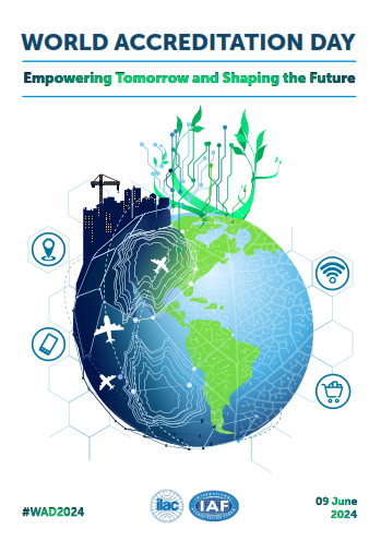
Our design reflects the universe of quality, where accreditation symbolizes movement along the optimal orbit for humanity. And just as the Earth cannot move out of its orbit, so moving through the orbit of accreditation consistently, step by step and day by day, empowers humanity and shapes a better future for people.
Accreditation is a new opportunity on a global scale, a chance for humanity to make the earth a source of clean water, tasty organic products, quality housing and sustainable legal norms. Through new accreditation schemes according to GLOBALG.A.P. and Organic standards, the food basket of mankind becomes tasty and healthy; through quality assurance in such areas as housing and transport, comfortable life and high mobility of people are ensured; through quality management systems, quality is ensured in all spheres of life for the sake of peace and happiness of those living on earth.
 How does your poster illustrate this year’s theme?
The universe of accreditation is the pathway to the new goals of zero hunger, clean water and sanitation, affordable and clean energy, industry, innovation and infrastructure and others called for in the UN Sustainable Development Goals 2, 6, 7,9, 11, 16 and 17.
• The clean water of the world’s oceans is represented on the globe in pure colours that evoke light associations.
• Ecological products that are produced in the green fields of the continents are represented as tender sprouts reaching for the sun.
• Sustainable development of the housing sector is represented as a construction site.
• Aeroplanes resembling paper planes from childhood, embodying children’s faith in goodness and a happy future, represent fast, comfortable and safe transport.
• A mobile phone, maps icon, and Wi-Fi represent the digital technologies that contribute to fair and effective social and public institutions.
Together, all these opportunities, the doors to which accreditation opens, are needed today more than ever by humanity and our common home – planet Earth.
 Joshua Egahi-Ojo Alhassan is a graphic and motion graphic designer from Kogi State, Nigeria with a B.Sc in Information Technology from Salem University. He has carried out design projects for the West Africa Quality System Programme (WAQSP), the African Accreditation Cooperation (AFRAC), the Nigerian National Accreditation System (NiNAS) and currently serves as the lead designer for SolaVieve Technologies.
What was the inspiration behind your design?
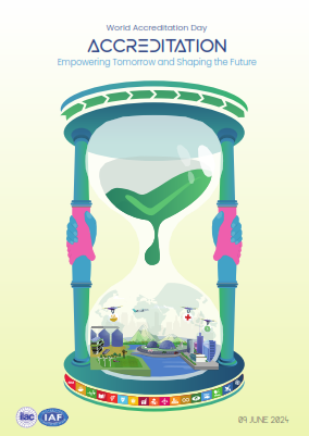
My design draws inspiration from the hourglass, known for its beauty and symbolic representation of time passing. The theme of this year’s World Accreditation Day points in one direction, which is the future, and I believe that time is the vehicle that gets us there. While contemplating my design concept, the hourglass on my workstation unexpectedly took on a deeper significance. Each element of its design seemed to narrate a beautiful story that resonated perfectly with the theme of the year and all it encompasses.
How does your poster illustrate this year’s theme?
My poster perfectly illustrates the theme, capturing its crucial elements in a visually stunning manner.
Beginning from the base and moving upward, the following elements are visible, each holding its own significance.
• The SDGs: I think the SDGs are a solid foundation for positive growth. I ensured the representation of every SDG icon, emphasizing their relevance to empowering tomorrow and shaping the future.
• The City: An overlay of the world map is used to depict the city as a microcosm of the world. When zoomed in, significant elements for enhancing quality of life become apparent. These include advancements such as good transport, smart infrastructure, innovative agricultural methods, access to food, healthcare, financial aid, and clean water.
• The Accreditation symbol: The accreditation symbol was positioned on the sand, emphasizing the pivotal role of accreditation in empowering tomorrow and shaping the future. As the accreditation sands trickle down, they contribute to the enhancement of the earth.
• The Arrows above: These arrows represent progress as they point in a forward direction.
• The Clasped Hands: These hands symbolize collaborative effort, serving as the pillars that uphold the structure. The blue color represents men, while the pink represents women. Together, we are stronger and more efficient than when we have conflict between genders.
In summary, my poster design visually conveys a world sustained through cooperation and shaped by the positive influence of accreditation.
